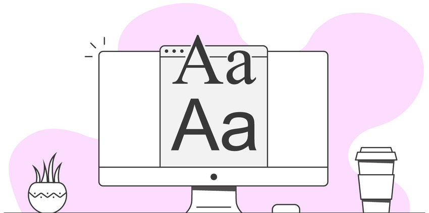
Typography is one of the most important aspects of web design, yet also perhaps one of the most overlooked. Anybody can choose a typeface, but choosing the right typeface and then displaying it correctly can be a crucial step to reaching your users. Here are some tips for enhancing your website’s typography:
Choosing the right typeface.
First of all, yes it’s called a typeface, not a font. Without getting into too many details, Helvetica is a typeface, 18pt Helvetica Light is a font. Moving on. Generally, when choosing a typeface for your website, the choice often comes down to serif vs sans-serif. There’s not necessarily a right or wrong answer here, but some people feel very strongly one way or the other. Recent studies have found that sans-serif may be slightly more readable than serif, but the margin is very slim and ultimately comes down to preference, and what you’re used to reading. Display fonts are fine for headers, but avoid using anything other than a basic serif or sans-serif for your body copy.
Font size and line-height.
The next step is deciding the right size and spacing for your chosen type. These values will need to change based on device type and screen size (see image below), but in regards to font sizing for a desktop the common rule is to choose something in the 16-21px range. Your line spacing (line-height) should be in the range of 130%-170% of your font size. For instance, if you have a font size of 16px, a line-height of 150% would equal 24px.
Line Length for maximum readability.
Another important aspect to typography for the web is setting a reasonable line length. There have been many studies on this, which all find that the ideal line length for maximum readability is somewhere in the range of 45-80 characters. This is probably one of the most easily overlooked topics of typography, but critical to retaining user attention. See the image below for examples of various character lengths.
A couple more things.
Anyone who has ever tried to read yellow text on a white background has experienced the importance of a proper contrast between your type and background color. A general rule is to shoot for a contrast of at least 4.5:1 between type and background, but this varies depending on the weight of your font. Finally, make sure to establish an appropriate visual hierarchy between headers and body copy. This will allow users to scan your content as needed to find what they’re looking for.
If you’d like some help figuring out the perfect way to reach your users by creating a beautiful, easily readable and scannable website, don’t hesitate to reach out. Let our design team help you out with that.
Check Out PSPinc Design Solutions
|
Pacific Software Publishing, Inc. 1404 140th Place N.E., Bellevue, WA 98007 |
| PSPinc Creates Tools For Your Business |
| Pacific Software Publishing, Inc. is headquartered in Bellevue, Washington and provides domain, web, and email hosting to more than 40,000 companies of all sizes around the world. We design and develop our own software and are committed to helping businesses of all sizes grow and thrive online. For more information you can contact us at 800-232-3989, by email at info@pspinc.com or visit us online at https://www.pspinc.com. |
 An all-new multi-service login for your PSPINC web apps!
 Request a quote for Custom WordPress Design

.png)


