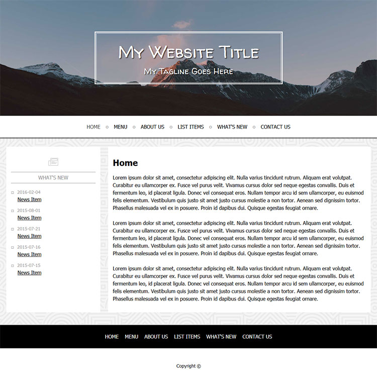
The look and feel of a website tells you a lot about a company. If you visit a website with a bunch of text, low-resolution images, too many ads or pop-ups, what kind of impression does it give you? You might start to feel like the whole thing is spam, or low-budget – and all of that reflects back on the business. Your website is your first impression for most, so make it a good one.
First things first, image quality needs to be light, bright, clear and professional. If you are using your own photos, the subject should be back-lit. Watch for shadows or unnecessary things in the background of your pictures. Don’t use any pictures that come out grainy or pixelated.
Consider using stock images for free or for a small price. If you have specific things that need to be photographed, it might be worth hiring a professional photographer to do the job. It’s said ‘a picture is worth a thousand words,’ and if that’s true, well, depending on its quality, a picture can really sell something or turn people off.
Keep plenty of white space within your site. Don’t over-clutter with images or banner ads. Don’t have too much tiny text. If someone needs to put on readers to read your content, you’re doing it wrong. And finally, pick one or two easy-to-read fonts you can use throughout your site.
Just remember, keep it simple, keep it organized, and if at the end it feels like a site you would feel comfortable browsing, you’ve succeeded. Stay with us for a few more final tips next week.
 An all-new multi-service login for your PSPINC web apps!
 Request a quote for Custom WordPress Design

.png)